Dental Web Design

About This Project
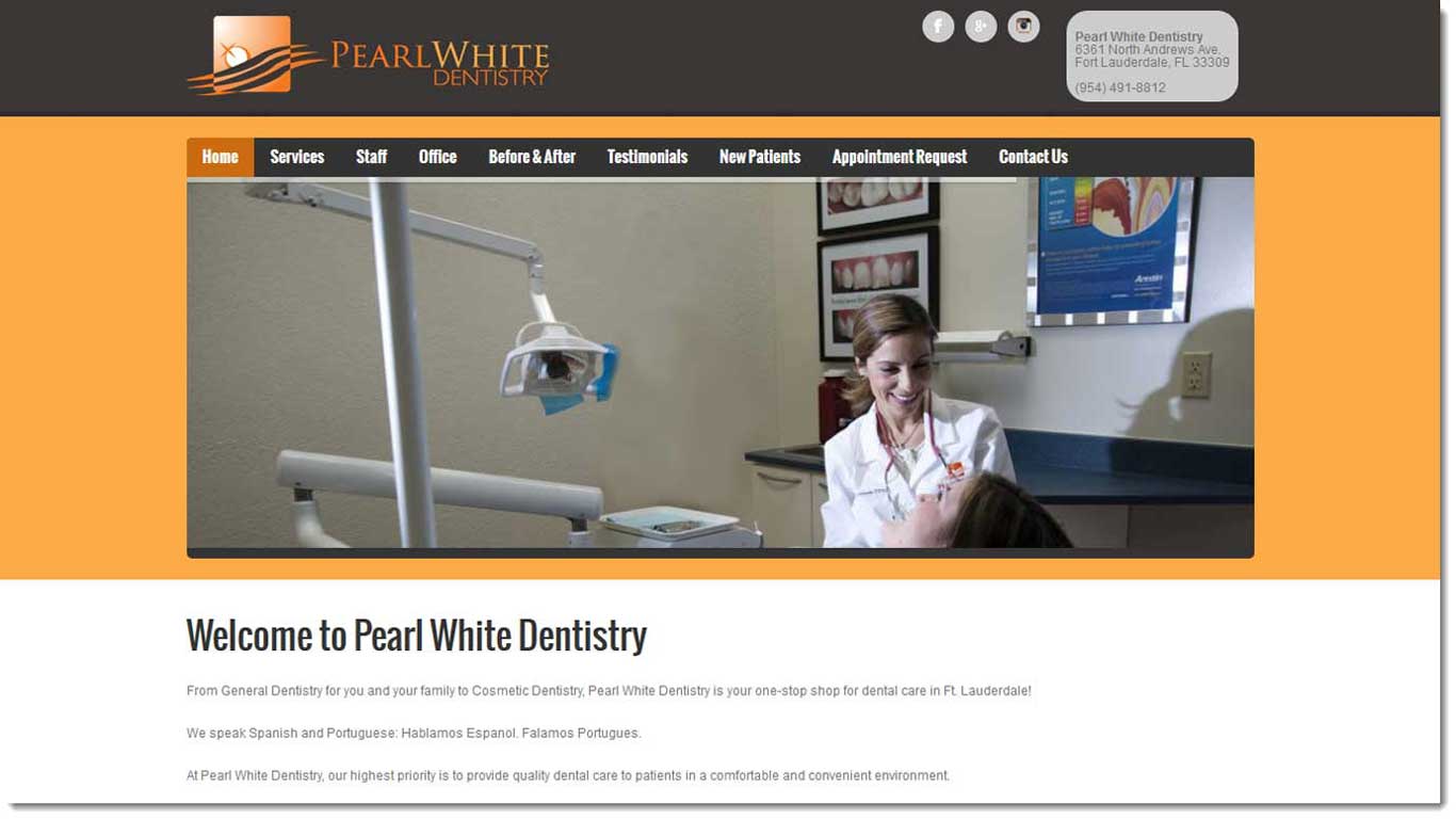
For this dental web design, we decided to use WordPress to keep things simple. This allows the dentist to have an easy to use content management system and a responsive, mobile-ready website. This is also an example of good dental office marketing. We didn’t use a stock photo of a fake dentist looking at a fake patient. What the dental office has for sale is friendly, gentle dentistry. The best way to convey that feeling is with a photo of the friendly looking dentist right on the homepage. This particular dentist used to have a fill in the blanks site with a photo of some fake dentist. It looked like all the other dental office sites and even had the same text as the others. We have a writer with a Master’s degree in journalism and she will write all the text for your new site.
Dentist Web Design
Anytime we work on a website for a dentist we always suggest professional photography. People don’t go to a dentist because they like the logo. A lot of people have had a bad experience with a dentist and are afraid to go to the dentist. With professional photography, we can get shots of the dentist looking friendly while speaking with a patient. We can also show the smiling faces of the dental office staff. The goal in any dental web design should be to make the office seem warm and friendly.
Since all of our web development is custom made all of our websites look different from each other. When a dentist hires a web design company that specalizes in dental office websites they are buying a fill in the blank template. Each dental office is unique and their websites should also be unique.
Please click to see more examples of our work at our advertising agency site.

